Most all mobile devices now feature an appearance setting to switch between light and dark mode. Even some browsers and operating systems support this feature on desktop devices nowadays. Wouldn't it be cool if our website could automatically match this user preference?
We'll go over how to accomplish this easily while keeping everything organized.
How We Typically Define Styles
Within your CSS you probably have many classes that control the colors of backgrounds, borders, and text.
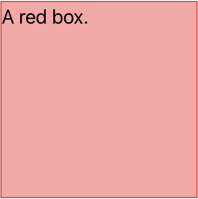
Here's a simple example of a CSS class to make a red box:
.a-red-box {
  background-color: #fca5a5;
  border: 1px solid #dc2626;
  color: #000;
  height: 200px;
  width: 200px;
}
This would generate a red box that looks like this:

Treat Dark Mode as an Overwrite
Now that we have our main styling, we'll overwrite the colors using a media query that's inlined into our class definition.
.a-red-box {
  background-color: #fca5a5;
  border: 1px solid #dc2626;
  color: #000;
  height: 200px;
  width: 200px;

  @media (prefers-color-scheme: dark) {
    background-color: #b91c1c;
    border: 1px solid #7f1d1d;
    color: #FFF;
  }
}
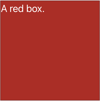
We placed our @media query nested at the end of our CSS class definition. The overwrites will be ignored for browsers that don't support this functionality. If a browser does support the prefers-color-scheme, the user will see a darker version of the red box when their device is set to dark mode. In dark mode our box now looks like this:

Final Thoughts
There you have it. We learned what red boxes look like and how to make them light or dark depending on a user's device preferences. To convert a whole website, you'd go through the site and apply these overwrites throughout your CSS. I'd also recommend using CSS variables or SCSS variables to store colors. This will help maintain consistency.